We’re watching a major geo-political re-alignment—the first in 40 years—play out before our eyes. Global neo-liberalism has run its course, and it is receding with each new headline. But for a lot longer, it’s been all too easy to slight the geo- part in the analysis of global politics. Much of the dominant narrative the past two centuries in Europe has been about supra-national ideologies, not rivers and mountains and coal seams. For the last century, advances in transportation have erased prior physical borders. (Look up and ponder the implications of SQ 23 and SQ 24. IYKYK.) And during the past few decades, technology has done away even with the idea of borders. The decentralized ledger of the internet blockchain has been promoted as the final coup de gras for the water’s edge, the lines in the sand, and the petty customs agents that come with both.
And then Russia invaded Ukraine in 2022. That act brought nearly a millennium of very geographic history back to the front page of global news and policy making. (The rapid unraveling of global neo-liberalism got an earlier start–no later than 2016–but Putin’s gambit is the tipping point for me.)
As you consider what comes next, you might want to pull out a map for a refresher on the relevant geography. And that’s when you’ll stumble on a very inconvenient fact: the maps are wrong. That map on your teenager’s wall: wrong. Almost all the maps on the internet: very likely wrong. In contrast, the nice-looking physical globe that is furniture in a library or in a used book store is right. Look at it, not the map, to get the geography right.
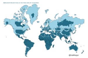
You might recall the problem from high-school. It is that a 3-dimensional sphere (a globe) cannot be represented on a 2-d surface (wall map) without distortion, a lot of distortion. This challenge has vexed mapmakers for centuries. The best compromise solution was proposed by Flemish geographer and mapmaker Gerardus Mercator in 1569. His projection puts the globe onto a flat sheet, but at a cost. And that cost is size. Mercator-based maps—the vast majority of 2-d maps you are likely to encounter—wildly overstate the relative size of landmasses the further away they are from the equator.
Russia is genuinely the largest country in the world, but our wall maps exaggerate the extent of that advantage. Same with Canada, Alaska and Greenland. They are big, but not that big. In contrast, the land by the equator gets shortchanged. That means the entire continent of Africa is vastly greater than it appears on a standard map, especially its north-south axis. The same is true for South America. Brazil is the beneficiary there. Taken to an extreme at the South Pole, the Mercator projection makes Antarctica look like the largest continent of all. It is not.
Most people who deal with geopolitical issues on a regular basis—or anyone who has flown to the Global South—is aware of the difference. But the rest of us will have forgotten that the distortion was mentioned quickly by our geography teacher before we moved on to Amerigo Vespucci’s travels.
So before we figure out what the new geo-political map is going to look like, let’s make sure we have refreshed our awareness of where the old one falls short. Find a genuine globe and take a few photos, like the ones below. Compare them to the wall maps. Start with the difference between Greenland and the continent of Africa. The former is approximately 2.2 million square kilometers; the latter is 30.4 million square kilometers. Now look at a standard map. The two landmasses appear to be approximately the same size, despite one being 14 times greater than the other.
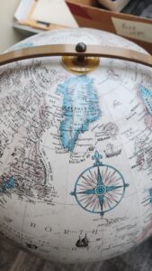 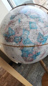 |
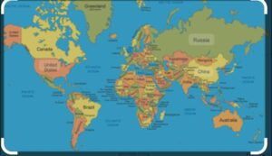 |
Now on to Russia. At 16.4 million square kilometers, it is the largest country in the world, but it’s not as big as a standard map suggests. Instead of being twice the size of Africa, it is roughly half.
Fortunately, the topic of map distortion is well covered by map nerds on the internet. OpenCulture.com has a nice projection from a scientist, Neil Kaye, that adjusts for actual country size. He also has a .gif that swaps the places of Mexico (1.98 million square kilometers) and Greenland, two landmasses that are roughly the same size, except on maps.
 |
How do the distortions of a wall map impact how we conceptualize geo-politics? During the march of global neo-liberalism, not by much. The whole point was to dispense with outdated notions. But with the rapid return of national borders, it is worth getting those relative sizes right. Policy makers and the taxpayers footing the bill deserve no less. And the map distortion makes you wonder: what other distortions play into our policy making. What else in our information landscape might be misleading? The past several decades has seen an outright war on empirical information, at least in certain media and educational circles in the United States. In both venues, empiricism seems to have lost out. As we shift geo-political paradigms, now would be a good time for an information reset. We thank Mercator for centuries of service, but we now have the technology and the need to expect more accurate inputs for our operating models.
